Whirlpool Forward
Whirlpool Forward
Whirlpool Forward
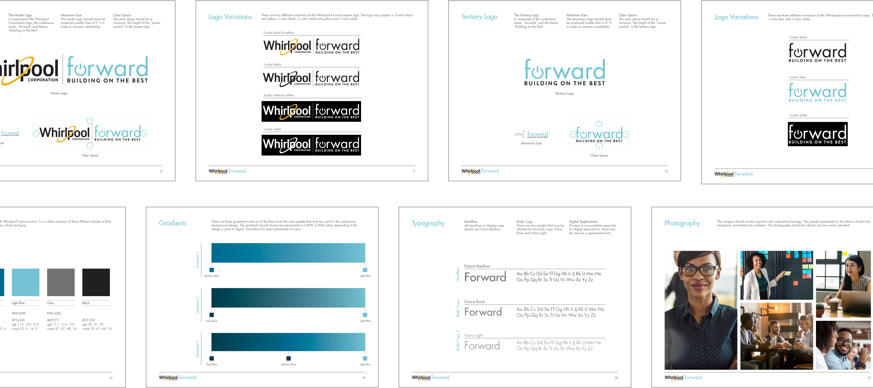
I designed the conference guidelines for Whirlpool's yearly sales conference, Whirlpool Forward. The client wanted an evergreen logo and identity that could last throughout the years and only the theme of the year would change.
Conference Guidelines
The guidelines included three variations of the conference logo and ways to use them. A sleek and versitile color palette that blended well with Whirlpool's brand colors and futuristic background gradients that made the conference logo pop. The typography I decided on was modern and strong, representative of Whirlpool's sales force. The moodboard of photography envoked the motivational and positive energy of the conference.
Conference App
Conference App
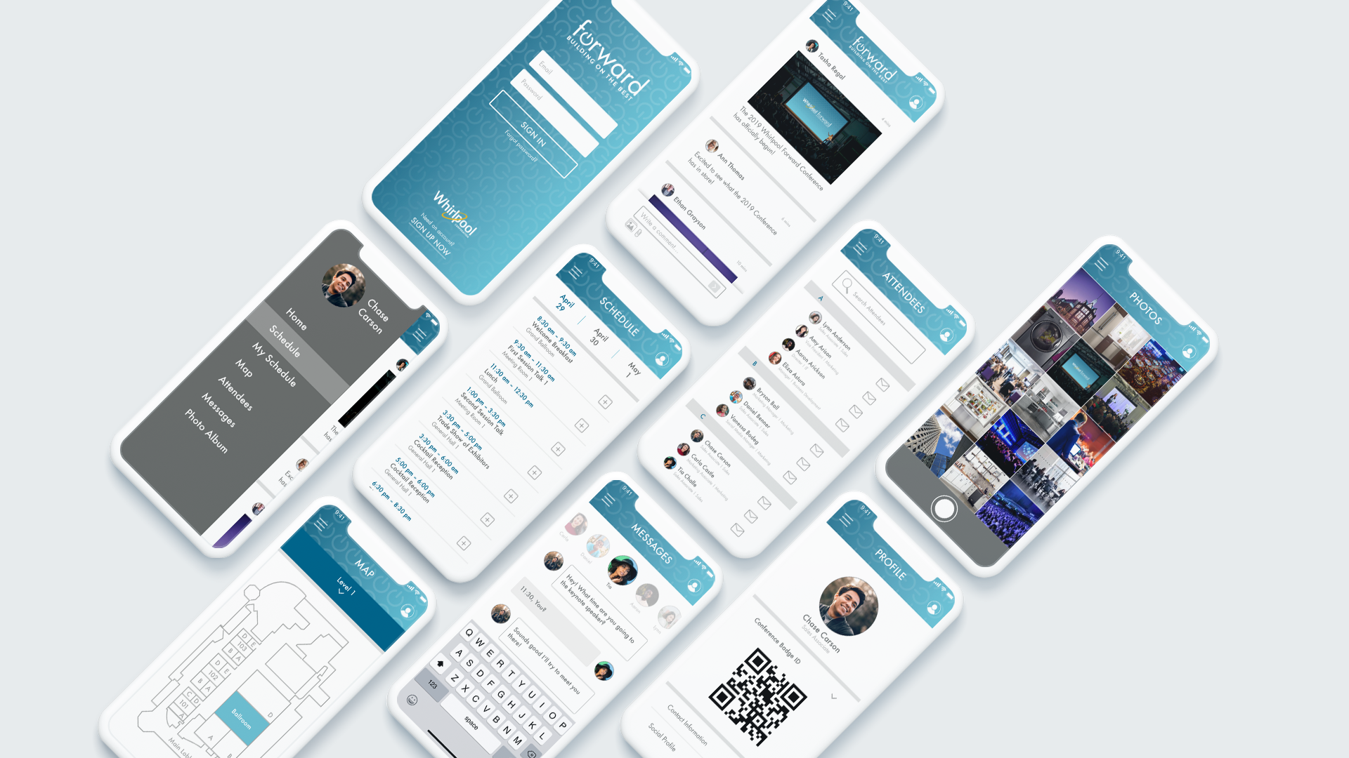
I designed a clean and easily navigable app for the Whirlpool Forward 2019 conference. I utilized a side nav push option to allow the most important information to be front and center. The home screen newsfeed provided an area for attendees to post relevant content and photos during the conference. Detailed schedules allowed for attendees to stay up-to-date on what sessions were going on and to add a session to their personal agenda. An attendee directory was included so attendees could connect and message with each other during the conference.
Implementation
Implementation
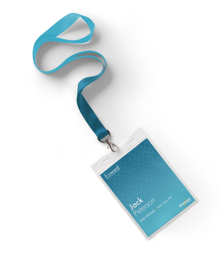
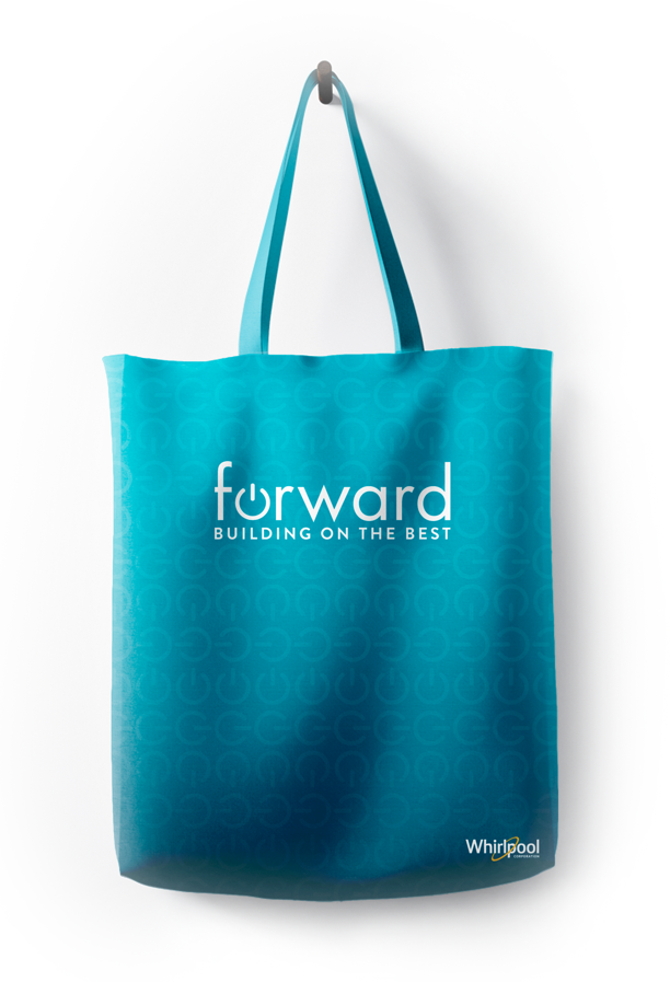
The name badge and tote demonstrate how the guidelines are pulled together. The use of the gradient, patterning, conference logo and variation in type.

Research & Wireframes
The Whirlpool Forward app was designed to show how the brand identity could be used in the digital space. I started my research by analyzing other sales conferences and what they included. I then gathered info from other event apps to see what seemed to be the common thread and what was important to incorporate into the design.
I created user flows and then began wireframing. After revising the wireframes in Adobe XD I developed low-fidelity prototypes. The initial feedback was that the navigation needs to be straight forward and nothing hidden. A full listing of the agenda was very important to have, but there also needed to be an option to create a customized agenda unique to each attendee. Attendees wanted a way to stay connected with each other so I added in a directory and messaging feature.

NEXT PROJECT
Following Filippo