Sabrage
Sabrage
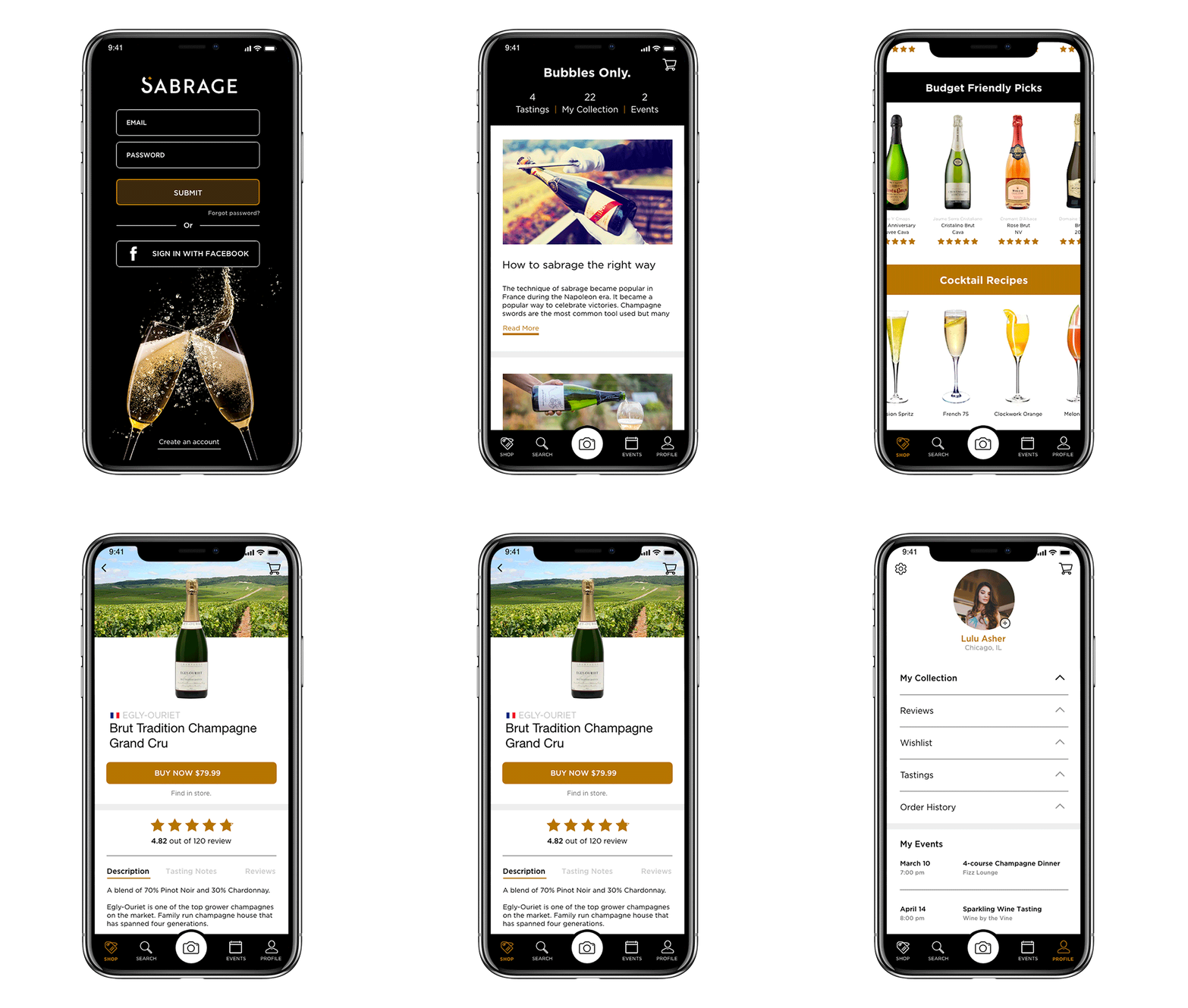
I developed the identity and design for a sparkling wine and champagne app called Sabrage. The app helps you navigate the world of bubbles. It has many robust features to guide you to select the perfect bottle every time.
The App
Sabrage is a specialized app that only features champagne and sparkling wine. The app provides detailed information about each bottle, along with tasting notes and reviews from other users. You can purchase the bottle, save it to your collection or find it in a store nearby. The app also includes a feature where you can take a photo of the bottle’s label and it will automatically pull up the bottle’s product page.
The goal of Sabrage is to provide a better understanding about the variety of champagne and sparkling wines available and to simplify the purchasing process.
Landing Page
Landing Page
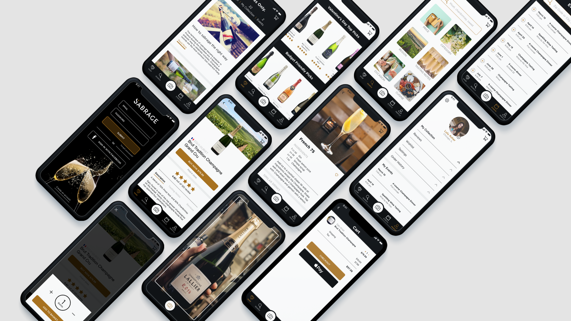
I designed the landing page to show off all of the important features of the app and what makes it different from the other apps that only focus on wine. I really wanted to highlight the reviews, recipes, education and robust search tool.
Sabrage Style Guide
Sabrage Style Guide
Sabrage Style Guide
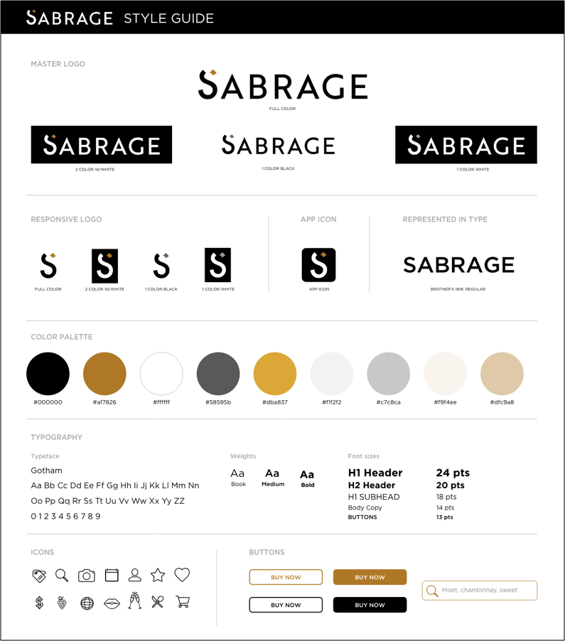
Sabrage's style reflects the luxurious feel that champagne has. I used champagne packaging as an inspiration for the style guide. I created a sleek color palette of black, gold, beige and white. I then chose different shade variations to help accent the brand.
The logo I designed mimics the act of sabrage, where a champagne bottle is opened with a saber. The top of the “S” is reflective of the cork flying off after the bottle is opened.
I kept the typography, icons and buttons in a minimalistic and clean style to stay consistent with the high-end feel.
The Research
The Research
I conducted extensive research regarding champagne and sparkling wine when I started to design the app. I examined what people looked for when they purchased a bottle, information regarding the vintage, grapes, region, how to pair it with a specific cuisine, price point, etc. There were many different factors that went into the process. I took this into account and developed a robust search feature that answers these questions.
In my competitive analysis I found numerous wine apps on the market, but there were very few apps that solely focused on champagne and sparkling wine. I wanted my app to be unique and specialized. The champagne apps on the market currently do not provide an extensive selection of products to choose from. They also do not have a feature that allows you to purchase the bottle from the app. I felt this was very important to include and also to allow users to find the bottle in a store near nearby.
Personas & Wireframes
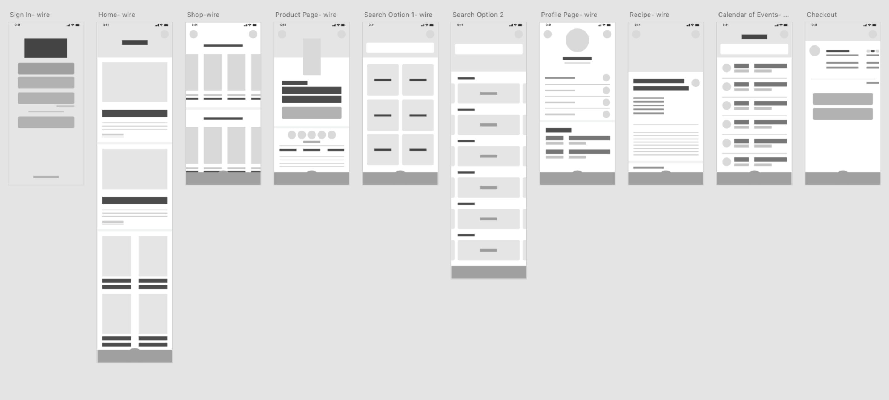
I worked on a user journey throughout the app and created two different personas to help drive the wireframing process. I used Whimsical to map out my process and then built out low-fidelity wireframes.
After my wireframes were completed and I created Sabrage's branding and style tile. I then began building out the design. I developed high-fidelity prototypes and conducted usability testing. I made revisions based on the testing to streamline my app and then used Zeplin for my final hand-off process.

NEXT PROJECT
Whirlpool Forward